The Challenge
Vina faced serious structural problems. 68% checkout abandonment rate, negative NPS, and a 2.8 rating. The numbers showed the experience was broken.
The previous interface suffered from fragmented flows, confusing visual hierarchy, and zero predictability. Placing an order was an 8-step disconnected journey with redundant information and lack of clarity about what came next. The challenge was to reorganize everything. Rethink the architecture, rebuild the flows, and create an experience that made sense: clear, cohesive, and truly user-centered.
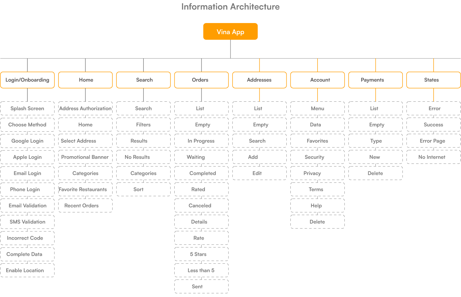
Wireframes and Structure
Before designing any interface, I structured the experience from scratch. The architecture covers all scenarios: main flows, empty states, errors, returns. Everything mapped and documented. This solid foundation ensured consistency in every decision that followed.
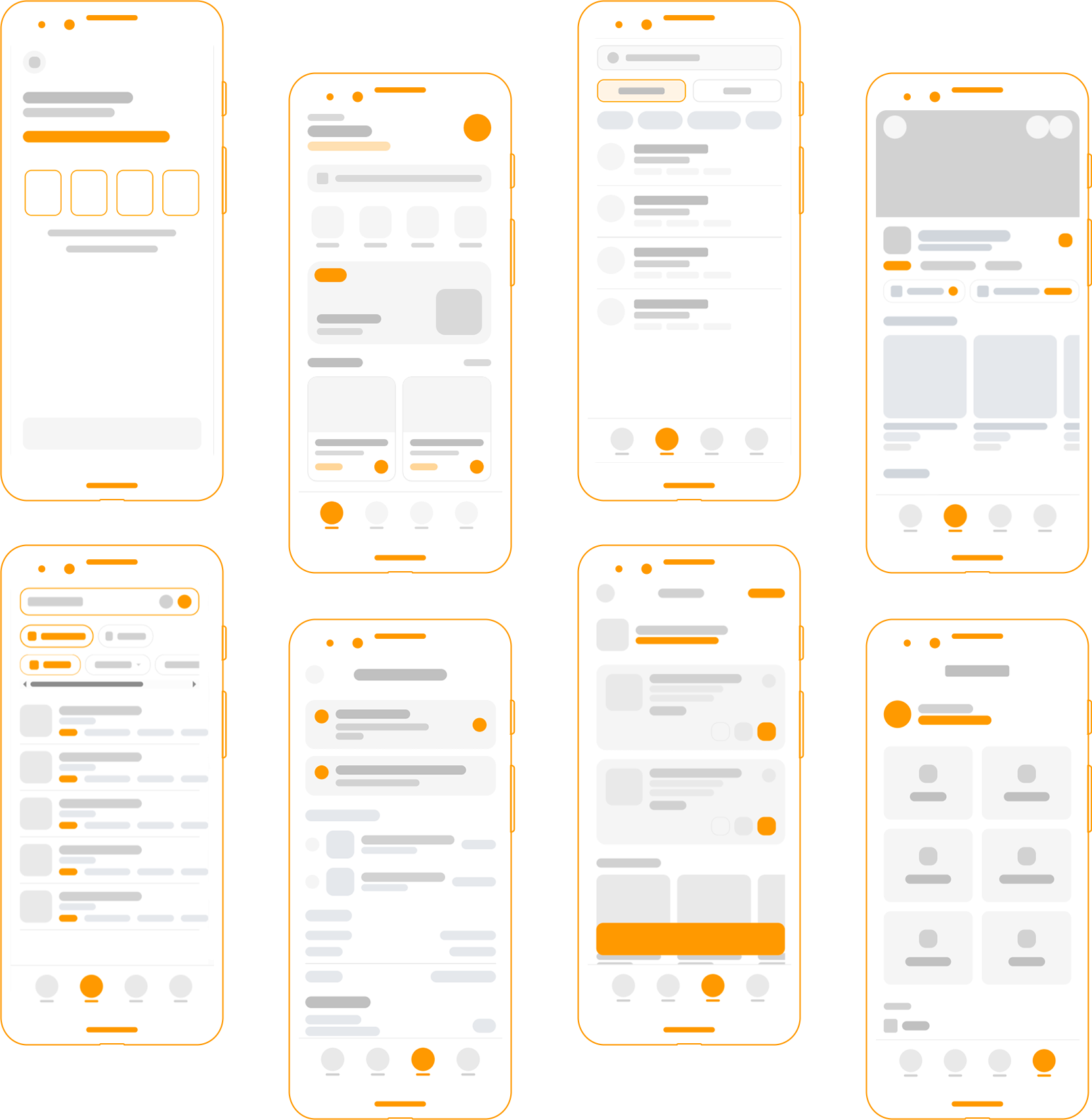
The wireframes materialized this structure. From 8 to 4 steps in checkout. Consolidated information, clear hierarchy, feedback at every action.
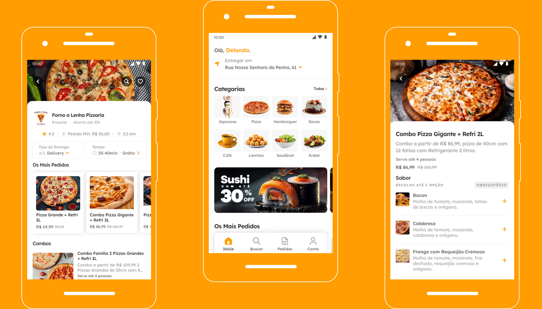
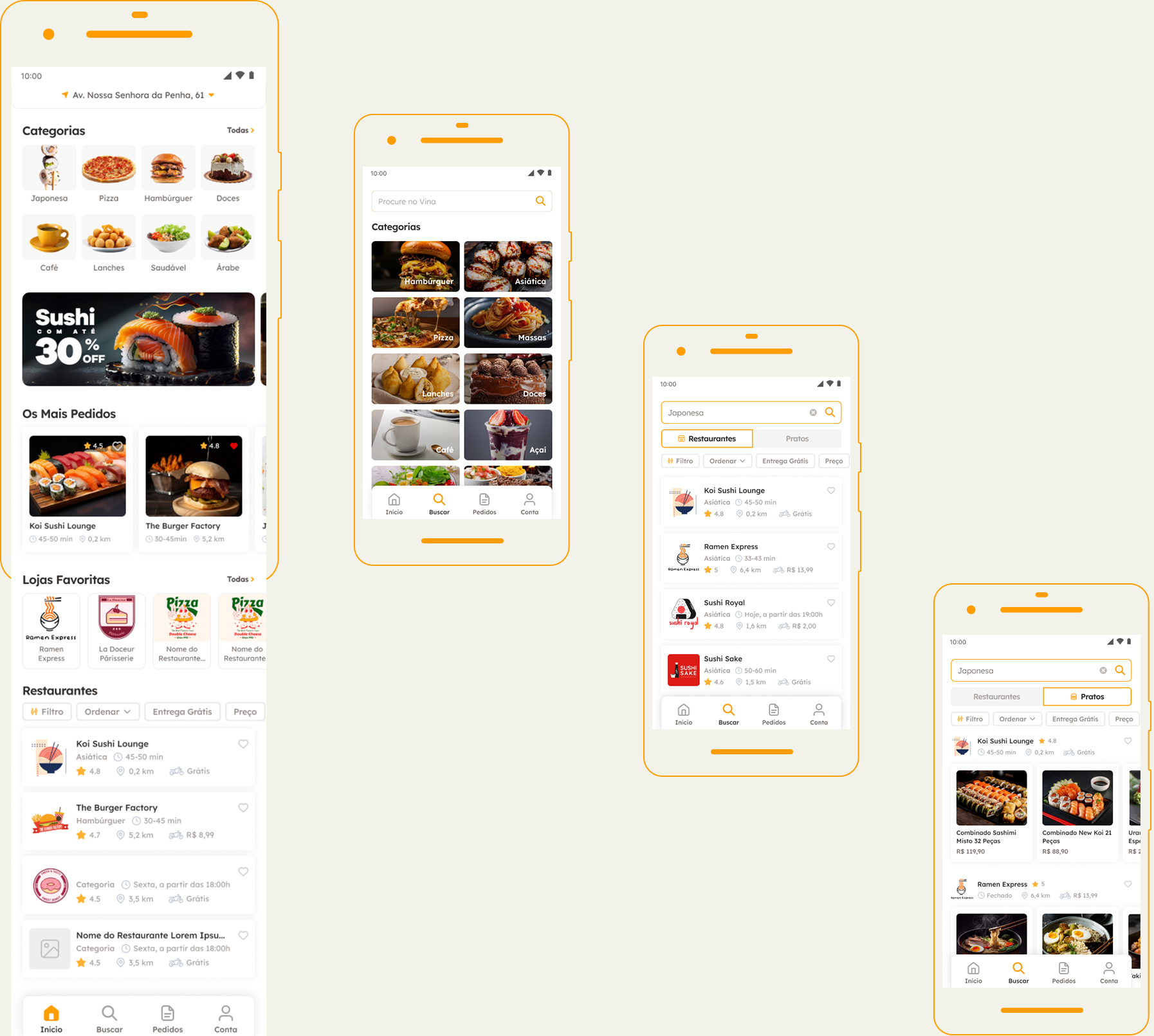
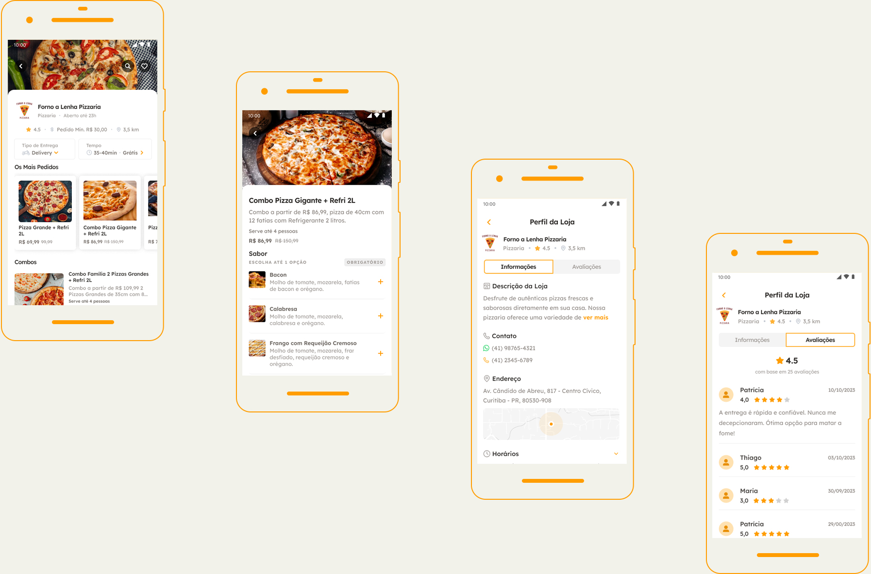
Design
The visual was designed to support the experience, not steal the show. Every UI decision prioritized clarity and ease of use.
Welcoming palette, readable typography, reusable components, visual hierarchy that guides the eye naturally. The result is an experience that breathes. Fluid, predictable, and reliable.
Every interaction has immediate feedback. Users always know what’s happening and what to expect next.
Results
Simplifying the checkout (from 8 to 4 steps) made all the difference—abandonment dropped from 68% to 31%. Order time was cut in half: from 4min32s to 2min18s. NPS rose from -12 to +38, and the rating jumped from 2.8★ to 4.3★. The modular design system and well-documented architecture ensure the app can scale without losing consistency or quality.