The Challenge
TestBooster originated from a strategic pivot: from a no-code tool for consumers to an enterprise platform targeting QA Engineers, Developers, and DevOps teams. With this repositioning came new users, new expectations, and a radically different level of product complexity.
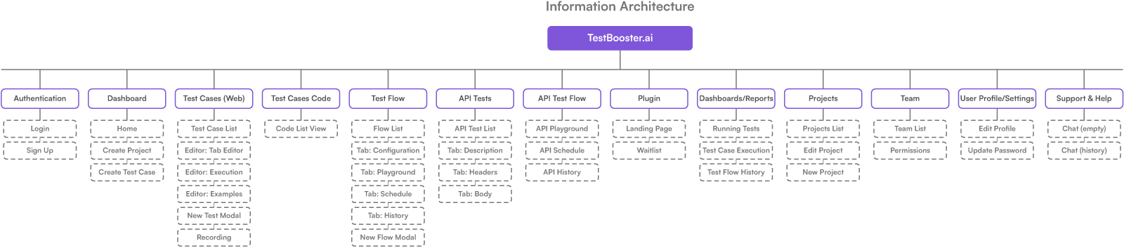
The existing system had 40 screens with no cohesive architecture: modules were added incrementally without a navigation pattern. Three distinct types of testing (UI, API, Flows) coexisted without a clear hierarchy. Technical users needed to configure complex automations, but the interface provided no visual feedback on execution states. A QA Engineer opening the dashboard could not tell what was currently running, what had failed, or where to start.
The challenge was to organize. Enterprise users tolerate complexity when it is predictable. The issue was unpredictability: each module had different interaction patterns, navigation did not maintain context, and execution states were communicated only through text, with no visual hierarchy.
Architecture and Flows
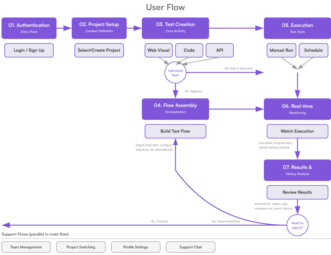
The restructuring started with information architecture: mapping the 40 screens into 12 functional modules and defining a journey pattern that repeats across all of them — list → editor → execution → results. Consistency in this pattern is what makes the system predictable.
UX and UI Decisions
Each decision was guided by the same premise: technical complexity is not an interface problem, but an architectural responsibility. The interface documents the state of the system, it does not hide it.
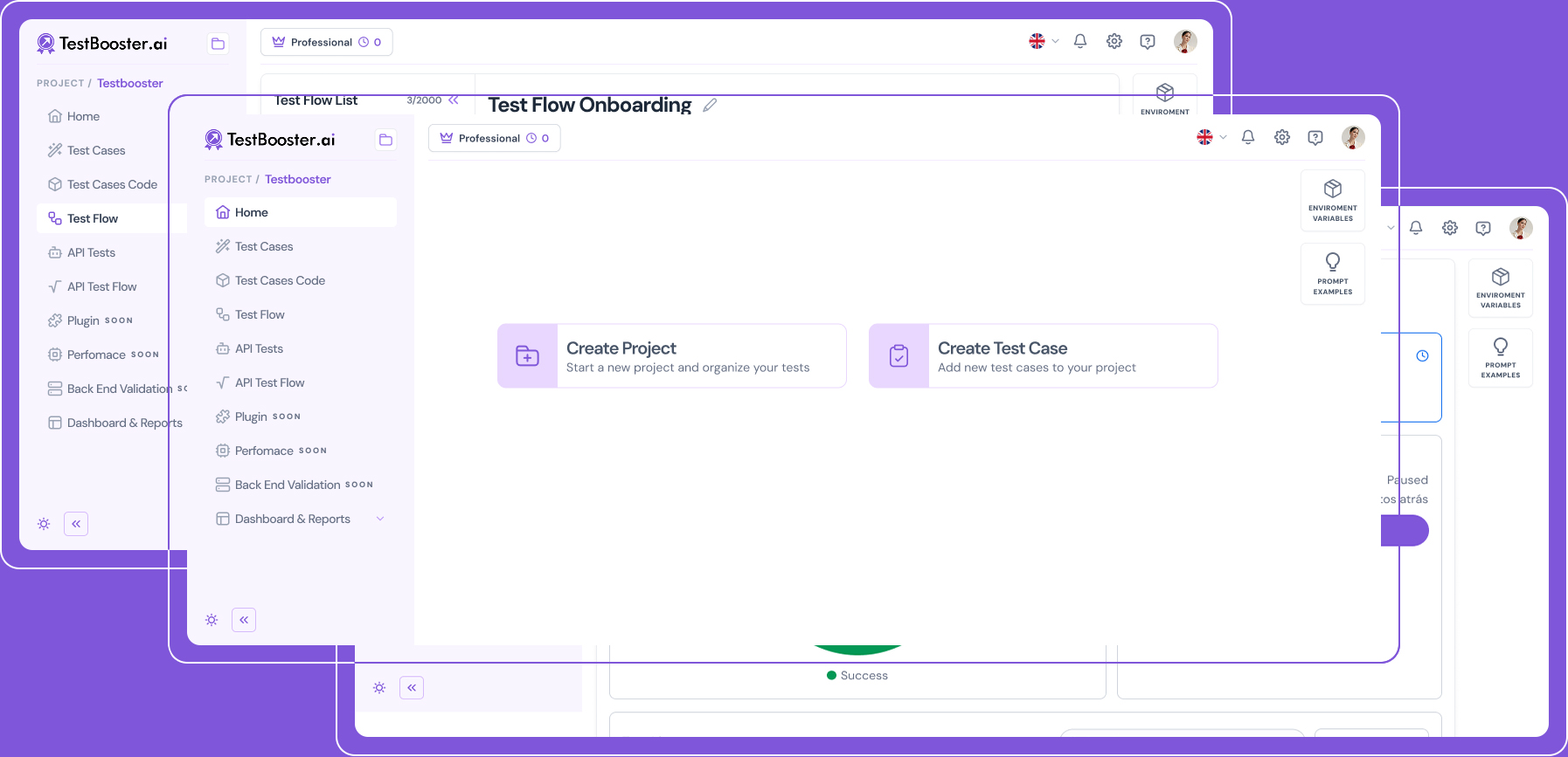
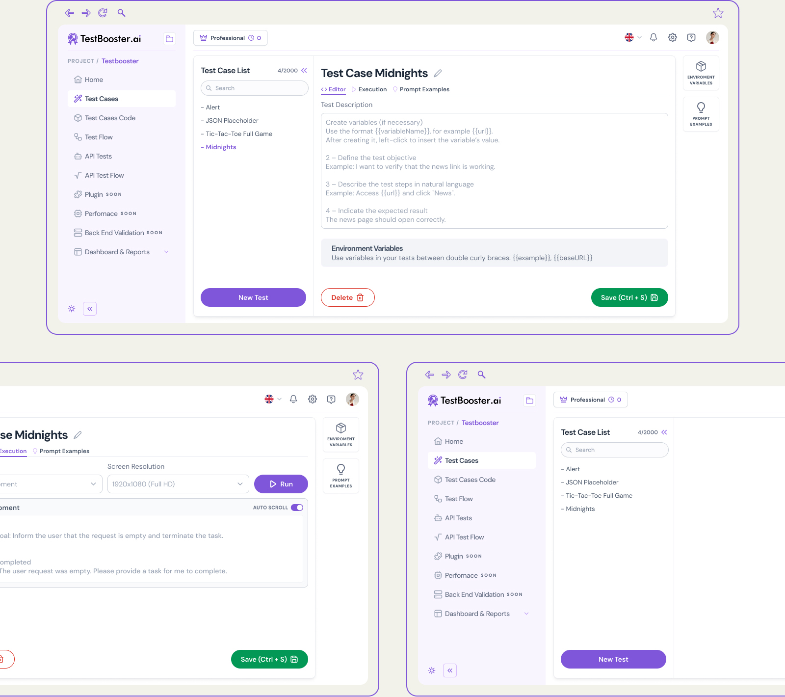
UX – Persistent sidebar: navigation that maintains context across modules. The fixed sidebar with icons and short labels highlights the active module in purple. When navigating between Test Cases, API Tests, and Flows, the active item remains visible — the user never loses context of where they are in the system. Modules are grouped by area (Testing, Orchestration, Management) with a visual separator between groups.
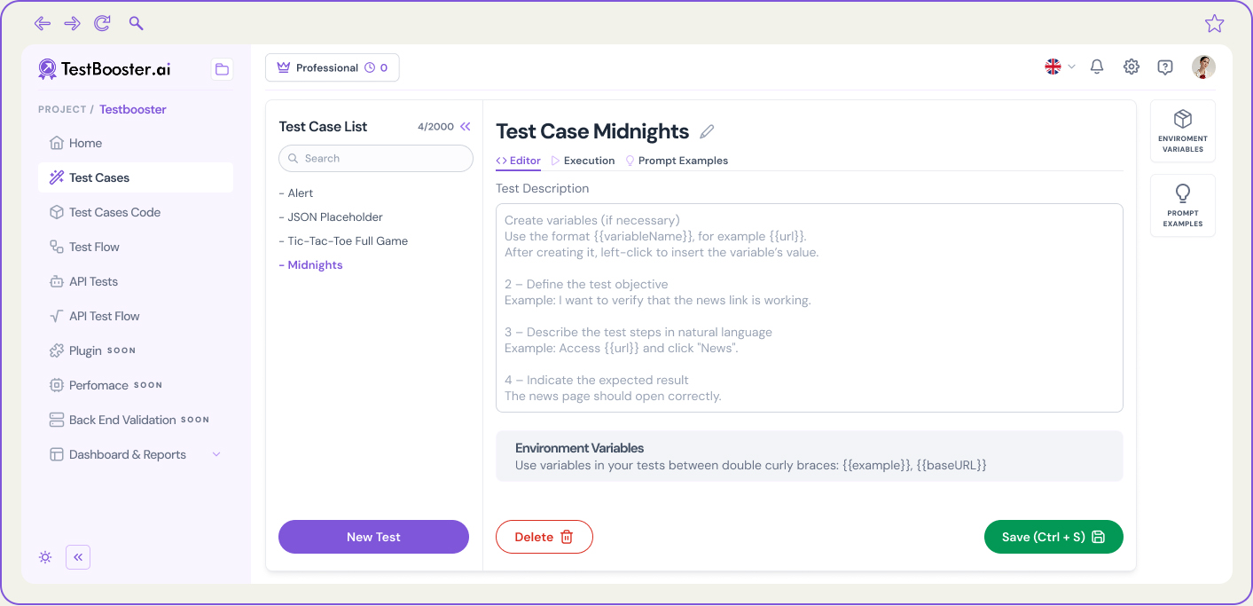
List → editor pattern: the same mental model across all 12 modules. Regardless of the module (Test Cases, API Tests, Flows, Team, Projects), the structure is always the same: list with filters and search, click opens the editor in the same context (not on a new page), breadcrumb indicates location. The user learns the pattern once and applies it across all modules.
UI – Status system: 4 states, 4 colors — applied consistently across the entire platform: Passed (green), Failed (red), Running (pulsing purple), Skipped (gray). The same tokens are used in badges, table rows, canvas node indicators, and execution progress bars. A QA Engineer learns the status system once — anywhere in the product, the interpretation is identical.
Scrollable log with error highlighting: during execution, the screen displays a step-level progress bar (not global), real-time output logs with syntax highlighting for errors and warnings, and a completed/total steps counter. The technical user sees exactly what is happening: execution is transparent, not a black box with a generic loading state.
Drag-and-drop canvas: Canvas drag-and-drop for sequencing tests without code. Test Flows allow orchestrating sequences of existing tests (UI or API) within a conditional flow — “if the Login flow passes, execute the Checkout flow; if it fails, notify Slack and stop.” The drag-and-drop canvas visually represents this logic without requiring the QA Engineer to write orchestration scripts.
Each node in the canvas displays: test type (UI/API/Condition/Notification), linked test case name, and last run status with color. Connections between nodes are directional lines with arrows, with no ambiguity in execution order.
4 node types with distinct visual identity, no legend: the canvas uses four node types, each with its own background color and icon: Test Case (purple — UI tests), API Test (teal — endpoints), Condition (amber — if/else logic), and Notification (gray — Slack, email, webhook). Color acts as the identifier — the user does not need to read labels to understand node behavior.
Discarded alternative: identical nodes with type indicated only via tooltip on hover. Using a tooltip as the sole identifier requires interaction to access essential information — an anti-pattern in high-density interfaces.
Results
Complete enterprise platform: from information architecture to all 40 screens, with documented patterns for handoff. The modular design system ensures that new modules can be added without breaking consistency.
40 screens documented with default, execution, error, and result states.
12 functional modules following the list → editor → execution → results pattern.
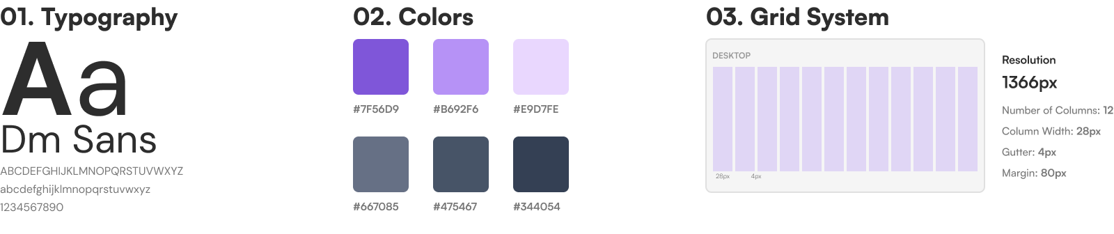
1DS design system with status tokens, table components, editor, and canvas.
0 duplicated navigation patterns — a single mental model applied across all 12 modules.