The Challenge
Vina was a local delivery app with real potential, but the experience actively harmed retention. A 68% checkout abandonment rate, negative NPS, and a 2.8 store rating. The data confirmed what users reported in reviews: placing an order was confusing and frustrating.
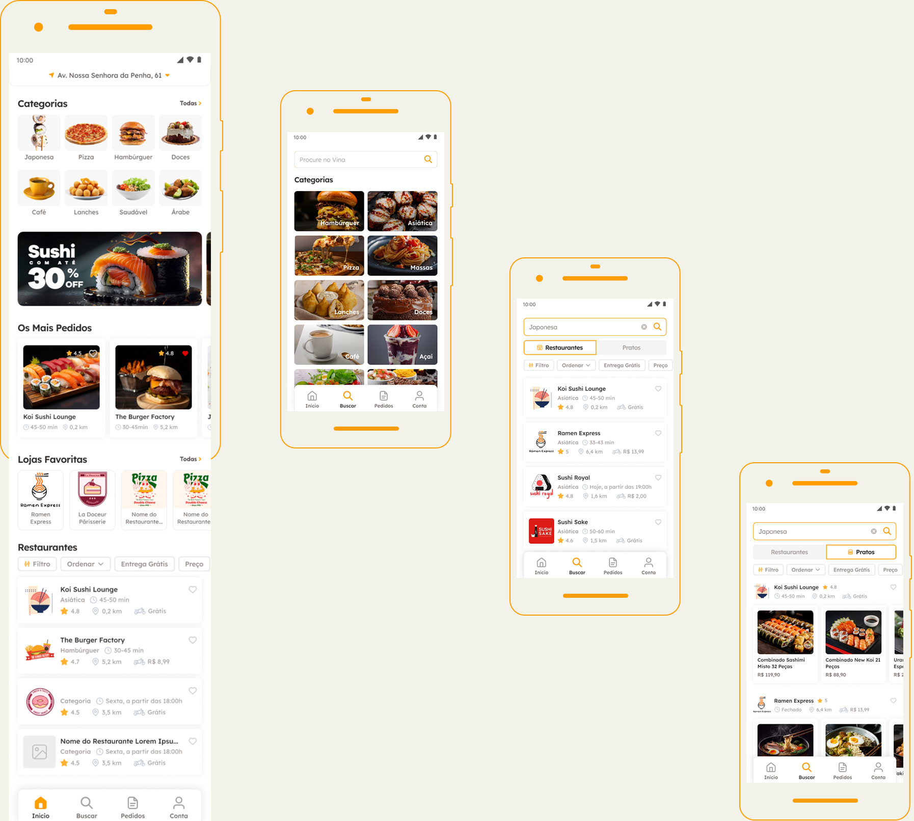
The original interface had fragmented flows across 8 disconnected steps, no clear visual hierarchy, and zero predictability. Users never knew what would come next at any point in the journey. Address information was requested at three different moments. The order summary before confirmation did not allow editing—any mistake required starting over from scratch.
The challenge was not visual, it was structural. Redesign the entire information architecture and core flows first, then layer the visual design on top of a foundation that made sense.
68% checkout abandonment rate: each unnecessary step increased the likelihood of users dropping off before confirming.
−12 NPS: more detractors than promoters. Even users who completed an order left dissatisfied with the experience.
8 steps: required to complete an order in the original flow, with redundant data and no feedback between steps.
Structure
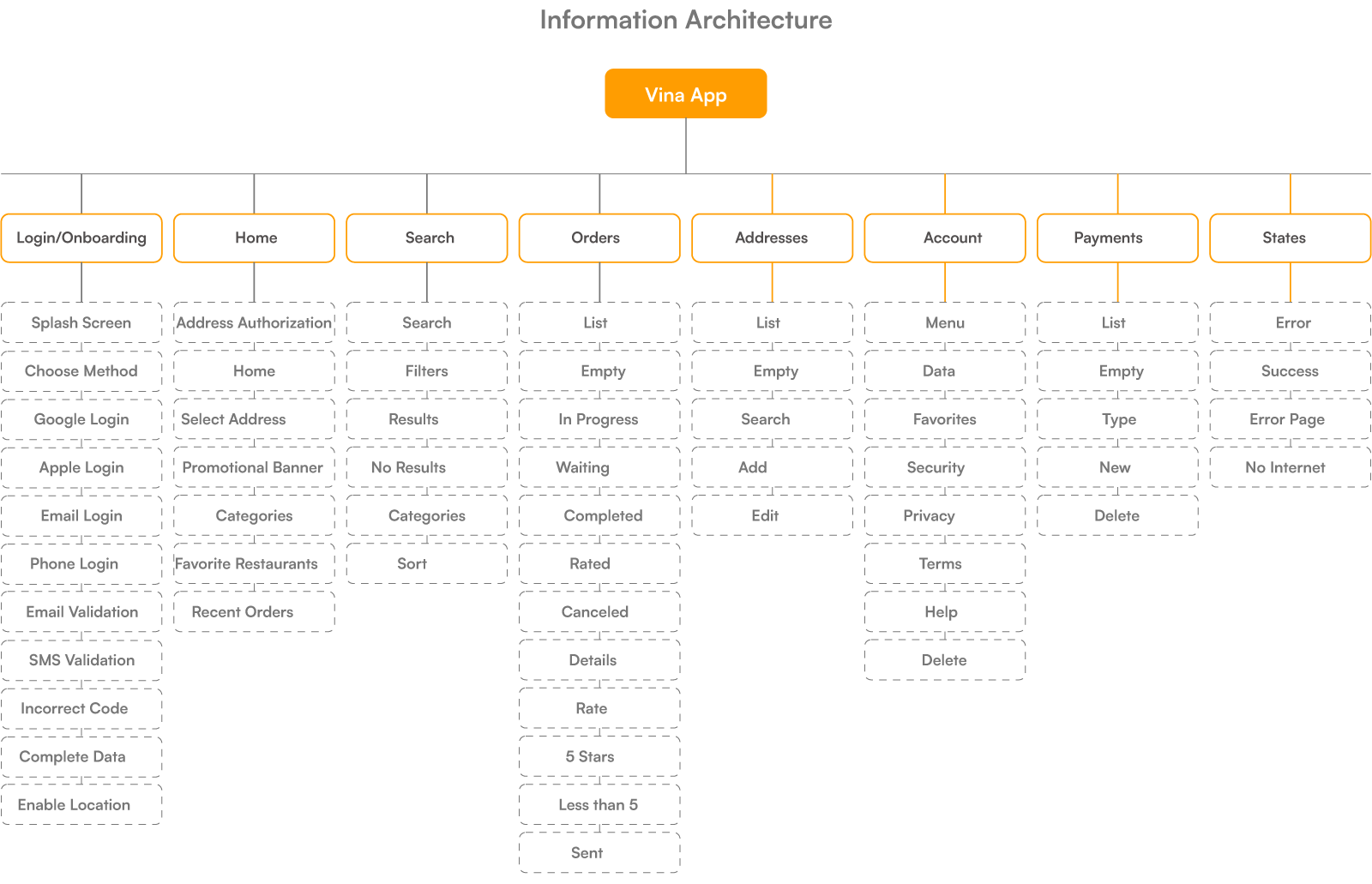
Before designing any interface, I structured the experience from scratch. The architecture covers all scenarios: core flows, empty states, errors, and returns. Everything was mapped and documented. This solid foundation ensured consistency across every decision that followed.
From 8 to 4 steps in checkout. Consolidated information, clear hierarchy, and feedback at every action.
UX and UI Decisions
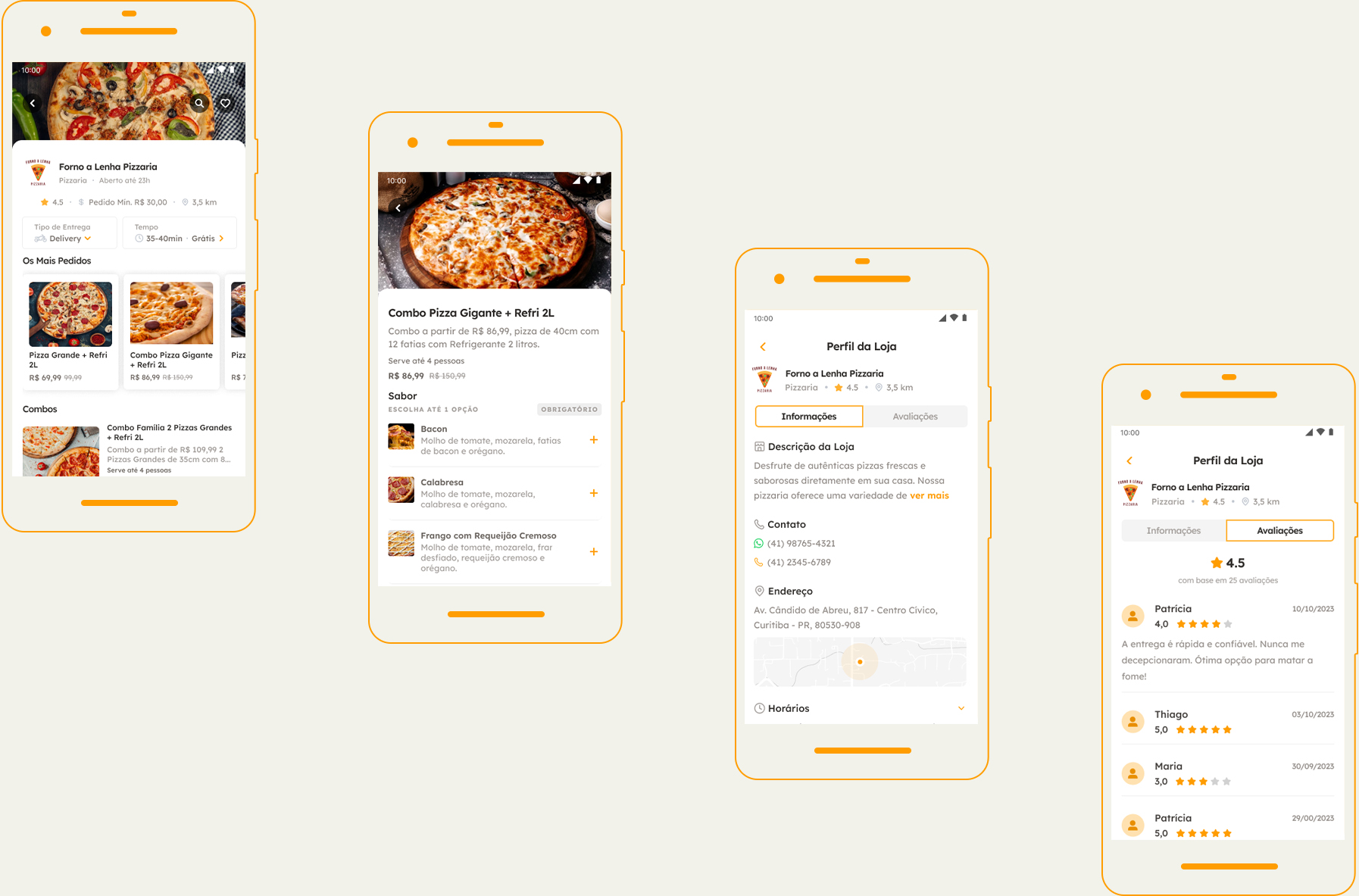
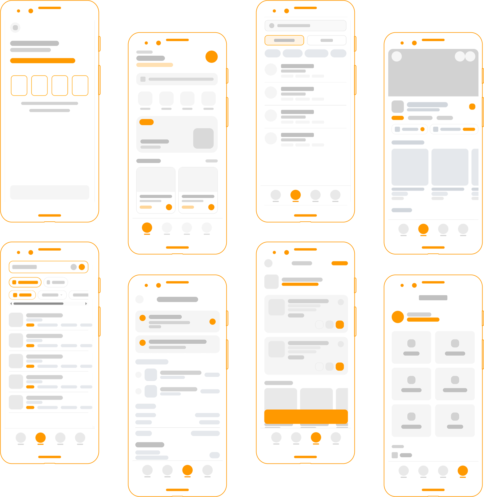
UX – UX – Checkout (from 8 to 4 steps): the original flow had 8 screens because each field was treated as a separate step. The restructuring consolidated related data: address selection with saved addresses was grouped into a single screen; cart and item customization were unified; the final summary now supports inline editing. No data was removed, it was reorganized.
Result: abandonment dropped from 68% → 31%. The improvement did not come from simplifying the product, but from organizing existing complexity.
Confirmation with inline editing, without step backtracking: on the summary screen before payment, each item, the address, and the payment method can be edited without leaving the screen. A pencil icon indicates editability. The alternative (“Back” button per section) was discarded because it created context disorientation and caused users to lose accumulated progress.
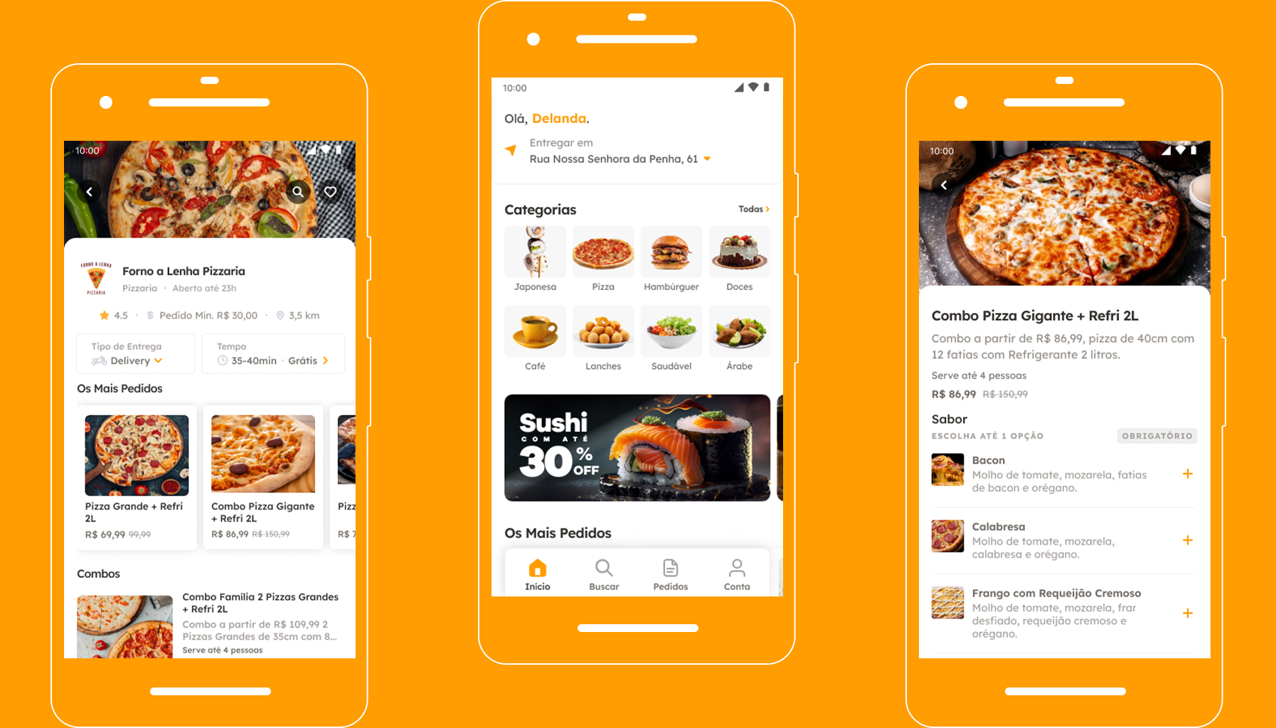
UI – Visual hierarchy to accelerate decision-making: on the Home screen, the hierarchy was redesigned to prioritize fast decision-making. Delivery time, fee, and rating now occupy the first layer of the cards, while secondary elements are visually deprioritized. This allows users to compare restaurants without opening each option. Decisions happen directly in the feed, reducing early-stage friction and preventing drop-off during exploration.
Color as an action guide: the primary color is used only for interaction states (active categories on Home, primary actions on restaurant screens, and confirmations in the cart). The rest of the interface remains neutral. This pattern is consistent throughout the flow, allowing users to quickly identify actionable elements without cognitive effort, reducing navigation errors and maintaining flow momentum through checkout.
Consistency that supports conversion: across checkout, summary, and payment screens, the same visual and interaction patterns are maintained. Information blocks, fields, and actions follow the logic already learned in previous steps. This continuity prevents expectation breaks at the most sensitive point in the flow. Users do not need to relearn the interface to complete an order, reinforcing a sense of control and directly contributing to the drop in checkout abandonment (from 68% to 31%).

System
Saved addresses prioritized, new address as a secondary action: recurring users (the majority) already have one or two saved addresses. The address screen displays saved addresses at the top as selectable cards, with “Add new address” as a secondary text action at the end. This hierarchy reduces effort for recurring flows without hiding the new flow.
CVV at confirmation: the CVV is requested at the moment of purchase, not during card registration. This reduces friction during onboarding (the most abandonment-sensitive step), maintains security at the relevant moment, and follows familiar e-commerce patterns. Saved cards display the last 4 digits alongside the card brand icon.
Closed restaurants maintain visibility with a dedicated state: restaurants outside operating hours remain visible in the feed with a dark overlay and a “Closed · Opens at 6 PM” badge. Removing them harms discovery, as users may want to favorite or plan future orders. The closed state is useful information—not a reason for removal.
Results
Metrics collected 90 days after the redesign launch. The simplified checkout had the most direct impact, but the combination of UX decisions is what sustains results over time.
−54% Acheckout abandonment: from 68% to 31% after reducing from 8 to 4 steps
+50 NPS points: from -12 to +38 within 90 days of launch
4.3★ app store rating: previously 2.8 before the redesign, improved within 6 weeks
61% post-order review completion rate – previously 12% with a full form.